Awards
IIDA Wisconsin - Award of Excellence
2023
Objective:
Hyperlocal Tech
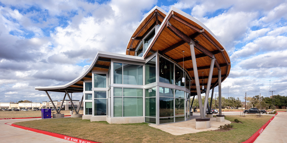
The Sienna Ranch Solution Center’s design concept was based on the idea of “hyperlocal tech”. The Sienna Ranch branch of this credit union creates a space that provides a uniquely local member experience centered around modern financial technology.
The financial industry is going through a big change and banks and credit unions are adapting their approach to meet new customer expectations. While most banking is now done online, having a brick-and-mortar space is still important as these spaces encourage engagement personally with the community.
The branch itself is outfitted with various technology to support modern-day banking. Interactive Teller Machines (ITMs) and the utilization of universal bankers are now more emphasized than individual tellers. As such, when users first enter the branch, the ITMs are displayed front and center, making the close proximity user intuitive encouraging immediate client engagement. As the client shifts towards this business model, a small teller line was implemented to be used during the transition period, especially for those unused to this way of banking. For specialty services, a video conference setup in the back offices is used to assist members with their specific needs.


SOLUTION:
Flexible Floor Plan
Although the space is rather compact, two businesses are located inside this building: the client’s credit union branch on the left, and a local bean roaster and coffee shop on the right. A certain balancing act was required to mesh the café’s current aesthetics with the credit union’s branding and the unique feel of the branch location.
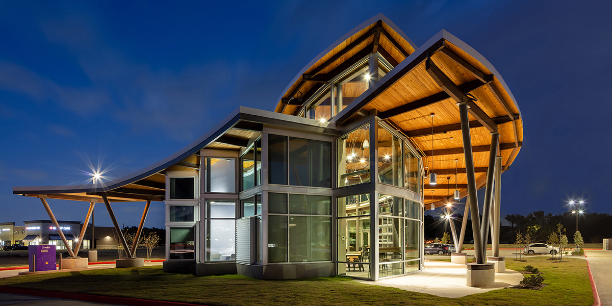
In the atrium, a large hearth acts as a central focal point. This space is for gathering and lounging, with an inviting fireplace, comfortable leather lounge seats, expansive displays, and local artwork exhibited across the space. Employees of the branch can relax and chat with each other while drinking coffee from the café. Pub-style seating is used around the perimeter of the café so members can easily seek out and engage with the space.
The atrium and floor plan in general is very flexible, with the ability to convert in a variety of ways to meet the community’s needs. The offices/huddle rooms are multi-use and can double as small meeting rooms or private workspaces. Each of these rooms is outfitted with versatile technology options for all online banking and video conferencing needs.

Comfy & Cozy
Finishes such as concrete, carpet tile, wood, metal, and ceramic tile reflect a neutral background for the branch’s branding to seamlessly integrate. Yellow, purple, and blue, the color of the credit union’s logo, is applied throughout the space. A distinct dot pattern in the conference room carpet again matches that of the logo. Creating a warm, and homey feeling for their members was essential to the design, as well as creating an interconnected feeling with the outside. Light and brightness from the outside are a major focus of the space, which is tempered with warm and timeless materials like the grand wood ceiling and the sealed-polish concrete floor. Imitation leather vinyl offers cushy and comfortable seating options for users as they enjoy their coffee or perhaps listening to a band on the patio.

Community Driven
Community connection and engagement were central to this space. Not only is the interior layout flexible enough to host different community events, but the two perimeter garage doors are also able to open up and connect the outside-in. Whether it encompasses an event about financial fitness or a local musician, the outside plaza is open for the public to enjoy. A large exterior pad was also specially designed to support the weight of food trucks that could be brought in. In consideration of the hot Texas weather, there is exterior shading and fans, with wooden seats that are comfortable in hot weather. The concrete exterior wall next to the entrance will be painted by a local artist and used as an “Instagrammable” opportunity. The community also resonates with the café, as they are a well-respected local bean roaster and recognizable coffee shop chain.
In the era of online banking, creating a space that is centered around community engagement allows this branch to provide a useful service to its members and community. The ability to open up the space, or rearrange the atrium for community events, and the focus on local artists and vendors, allows the Sienna Ranch branch to settle in at home in this community.


